
Why colour makes a difference in your hospitality business
You walk into a restaurant and immediately feel: this is right. Or not. Colour is often the silent force behind that first impression. For you as a hospitality entrepreneur, hotel manager or canteen manager, the choice of colour in your hospitality furniture is a strategic decision. It not only determines the atmosphere, but also how long guests stay, whether they come back and even how much they order. So it’s time to consciously choose a colour combination for your hospitality interior that reinforces your concept.
Trend colours and how to use them
Every year, we see new colours popping up in the hospitality industry. Think warm earth tones, rich terracotta colours and deep moss green, which are currently trending. These natural shades bring tranquillity and authenticity to your space. In addition, deep blue and velvety saffron yellow accents remain popular for a luxurious look.
But how can you apply these colour trends without making your interior look dated? The secret lies in moderation. Use trend colours for furniture or as accents, such as in hospitality barstools along the bar or in cushions on your sofas. This allows you to remain flexible and easily update your interior when the next trend comes along. For your base, choose timeless shades that will last for years.
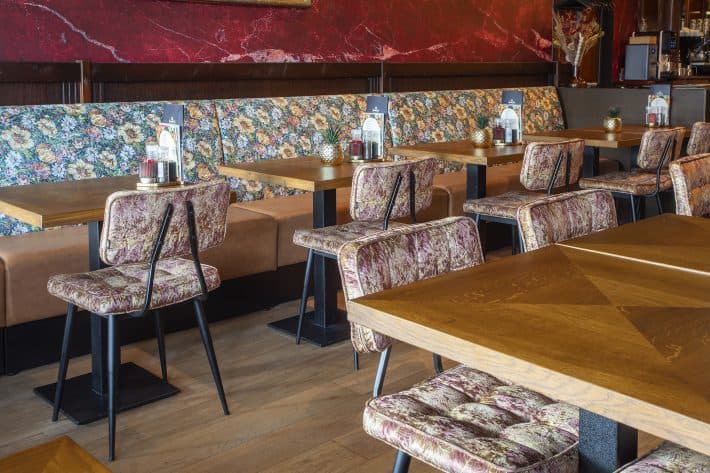
Accent colours vs. neutral base: finding balance in furniture
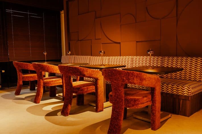
This is where it gets interesting. You want to stand out, but also remain practical. The golden rule: work with a neutral base and add targeted accent colours. For your main furniture, such as hospitality chairs and tables, choose neutral shades such as sand, grey, taupe, or black. These colours are timeless, easy to combine and show less wear and tear.
Then come the accent colours. These are the splashes that give your interior character. Use these for a maximum of 20-30% of your interior. Think of a coloured armchair in the waiting room, brightly coloured stools at the bar or striking slats in corners where you want to draw attention.
How can I combine bright colours without making it too busy?
Bright colours are great for energy and attention, but if you overdo it, your business will quickly feel like a fairground. Here’s how to maintain balance:
- Work with one main colour – choose one bright shade as the leading accent
- Limit yourself to two or three colours – any more than that creates visual noise
- Use the 60-30-10 rule – 60% neutral base, 30% secondary colour, 10% accent
- Distribute the colour throughout the space – repeat the same shade in different places for cohesion
- Also consider resting points – give the eye a place to land on neutral surfaces
This approach creates dynamism without chaos. It is exactly what you are looking for if you want to make a bold choice that will still work in five years’ time.
Combinations that are visually appealing and practical
Now we come to the heart of hospitality interior colours: combinations that are not only beautiful, but also smart. Because you know better than anyone that your furniture has to withstand intensive use, be easy to clean and be resistant to scratches and wear and tear.
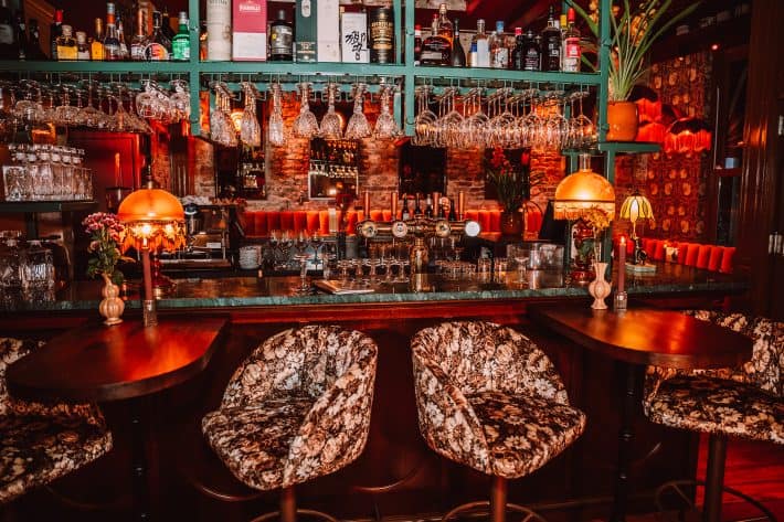
That’s why materials play such an important role. A dark blue fabric seat hides stains better than a light grey one, while a metal frame in golden yellow or copper red adds a cheerful accent without any maintenance worries. At Kaja, we only work with top-quality furniture that guarantees this combination of aesthetics and durability.
The psychology of colour: how guests feel in your interior
Colour has an effect on people. That’s not a marketing cliché, but proven psychology. And you can use that to influence the experience in your restaurant, café, or hotel.
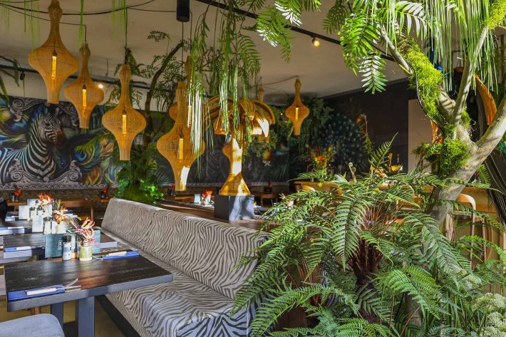
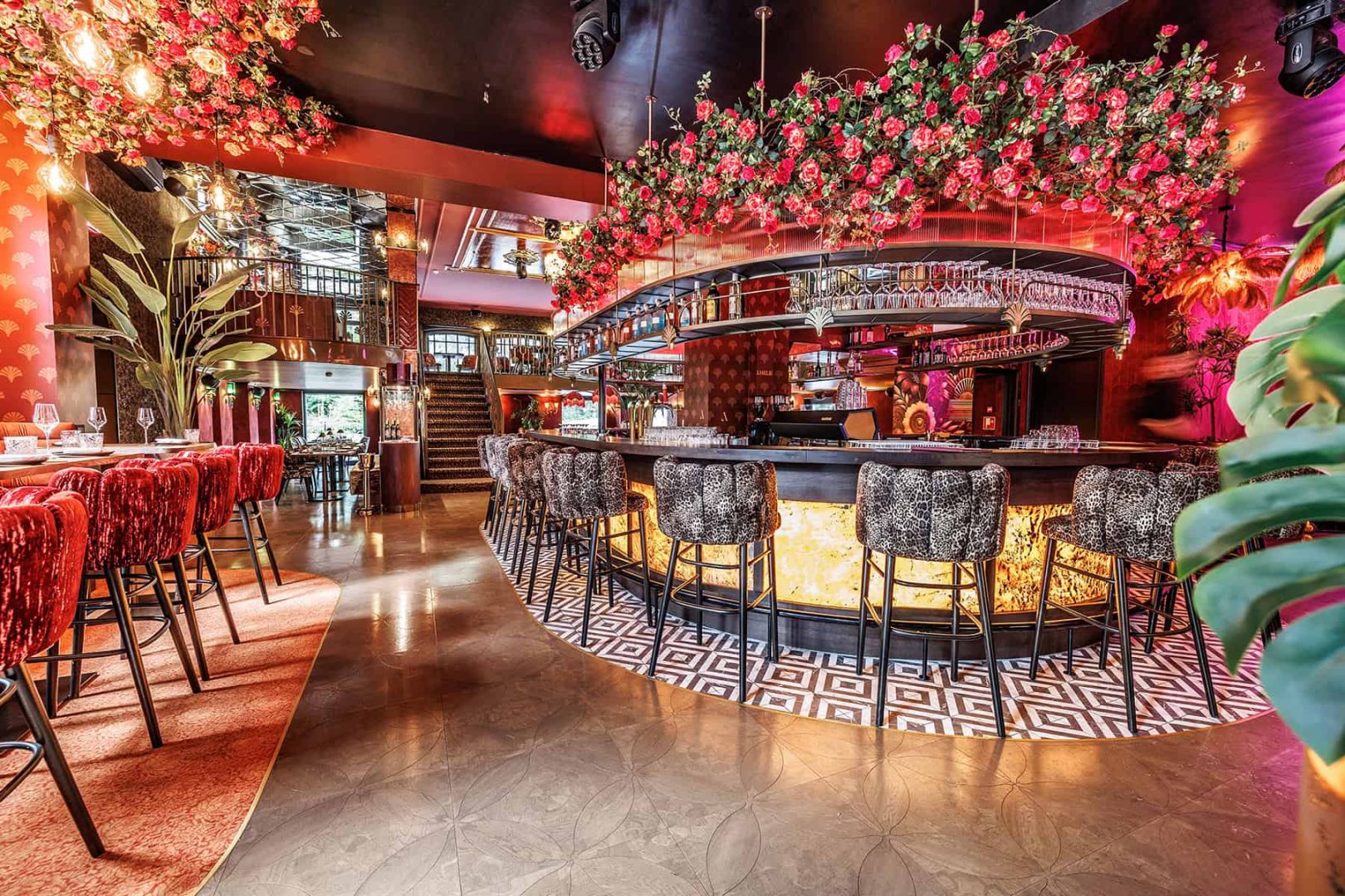
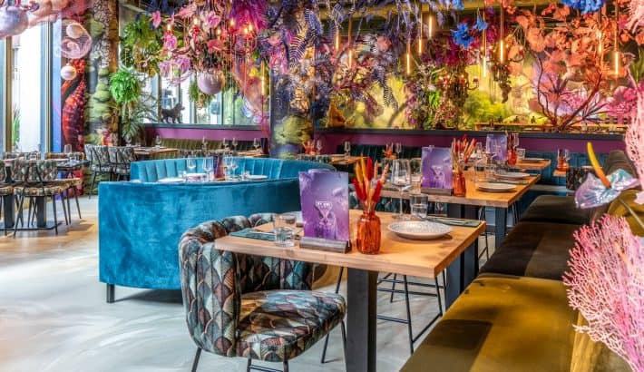
Red, for example, increases the heart rate and stimulates appetite, ideal for fast casual concepts where you want high turnover. But too much red also causes restlessness, so use it sparingly. Blue, on the other hand, has a calming and professional effect, perfect for business dinners or boutique hotels. Green brings balance and associations with health, think juice bars or organic concepts.
Yellow gives energy and cheerfulness, but can be tiring if used excessively. Orange combines warmth with accessibility, great for informal dining venues. And neutral colours such as beige and grey give peace and quiet and allow the focus to be on the food or the art on the wall.
How do you choose colours that suit your hospitality concept?
Your choice of colours tells a story about your brand. A Michelin-starred restaurant chooses different shades than a city brewery. That’s why you always start with your concept. Ask yourself: what atmosphere do I want to create? What emotion do I want my guests to feel?
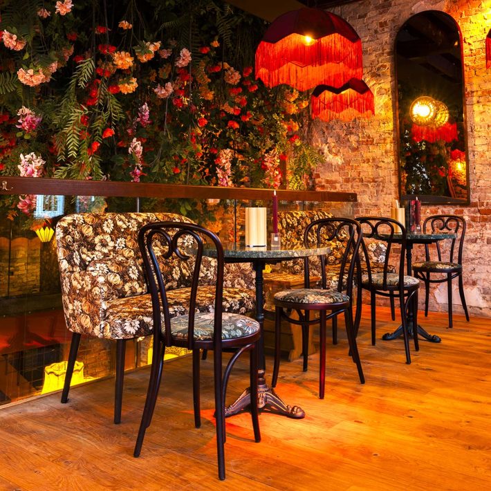
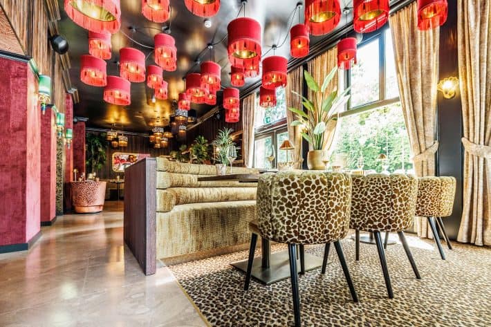
For a classic restaurant, work with dark, rich colours and golden accents. A modern café calls for stark contrasts: black and white with bright accents. A family restaurant thrives on warm, inviting shades such as terracotta and soft green. And a hotel lobby calls for neutral luxury with subtle, high-quality accents.
Match your colours to your target group, too. Young, urban visitors appreciate boldness and contrast. Business guests seek timeless elegance. Families want warmth and familiarity. And for canteens, the rule is: fresh, energetic, but not distracting.
At Kaja, you get tailor-made hospitality establishments. That means you’re not stuck with standard colours, but can choose what really suits your story and target group.
Practical tips for choosing colours for different types of hospitality establishments
Let’s make it concrete:
For a restaurant: Combine dark, rich colours with warm accent lighting. Think dark blue with brass, or dark green with warm woods.
For a café or bar: Be bolder here. Bright accent colours on stools, industrial black or metal bases with brightly coloured cushions or backs.
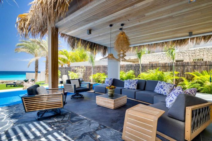
For a hotel lobby: A neutral, luxurious base with one signature colour that recurs in art, cushions, and flowers. Think champagne colours with deep teal.
For a canteen: Fresh and energetic. White or light grey as a base with cheerful accents in yellow, green, or orange to create a positive working atmosphere.
For a terrace: Weather conditions play a role here. Choose colours that can withstand sun and rain. Almost all hospitality terrace chairs in our collection are UV-resistant.
Maintenance and colour: what should you pay attention to?
You have chosen a beautiful interior, but it must also remain practical. Light colours in frequently used areas are a risk; they show stains and wear more quickly. For areas with high contact, always opt for darker or mixed shades.
Also pay attention to materials. Dark-coloured faux leather is easy to clean and suitable for intensive use. Fabric, on the other hand, provides more warmth. Powder-coated metal frames are scratch-resistant and available in almost any colour.
Drawing inspiration from existing collections
Sometimes the easiest place to start is simply to look what’s available. At Kaja, you’ll find a selection of more than 1,500 products in countless colour combinations. From classic black and timeless grey to bold mustard yellow accent chairs and deep pink lounge sofas.
Be inspired by complete settings. See how colours work in combination. See how a neutral base comes to life with a single accent colour. And discover which materials and shades enhance your personal hospitality concept. Explore our many style rooms and get a complete picture of an interior, rather than just individual pieces of furniture.
Determine your colour strategy together
Colour is powerful, but also personal. What works for one business may feel forced for another. That is why customisation is so important. At Kaja, we are happy to think along with you. What atmosphere suits your concept? Which colours reinforce your brand? And how do you combine that with sustainability, comfort and practical use? Questions we can well imagine. Our advisors are ready to support you with personalised advice and work with you to find what suits your hospitality interior.
Whether you are planning an entirely new interior or want to freshen up your current decor with colour accents, we are happy to help. Contact us and discover how colour can transform your hospitality business into a space where guests want to be.